OVERVIEW
Almost from the start, Intuit's TurboTax Live (TTL) and QuickBooks Live (QBL) businesses grew so rapidly the hiring team had difficulty filling all the open positions on those teams every year. Intuit Academy (IA) was created to help with the problem by enabling anyone, to learn tax or bookkeeping and become a qualified job candidate for TTL or QBL. But after two years it was still coming up well short of all its pipeline targets.
We redesigned the product experience from the ground up, and increased the number of enrollments by 12x, the number of people earning tax certificates by 3x, and the number of program graduates hired as TTL or QBL experts by 7x.
CHALLENGES
Product and marketing confusion
The site statistics showed more than half of the people who signed up never completed a single course, so something was clearly wrong at the top of the funnel. The most obvious problem was the look and feel of the site didn't change after a visitor to the site registered, logged in, and began taking courses.
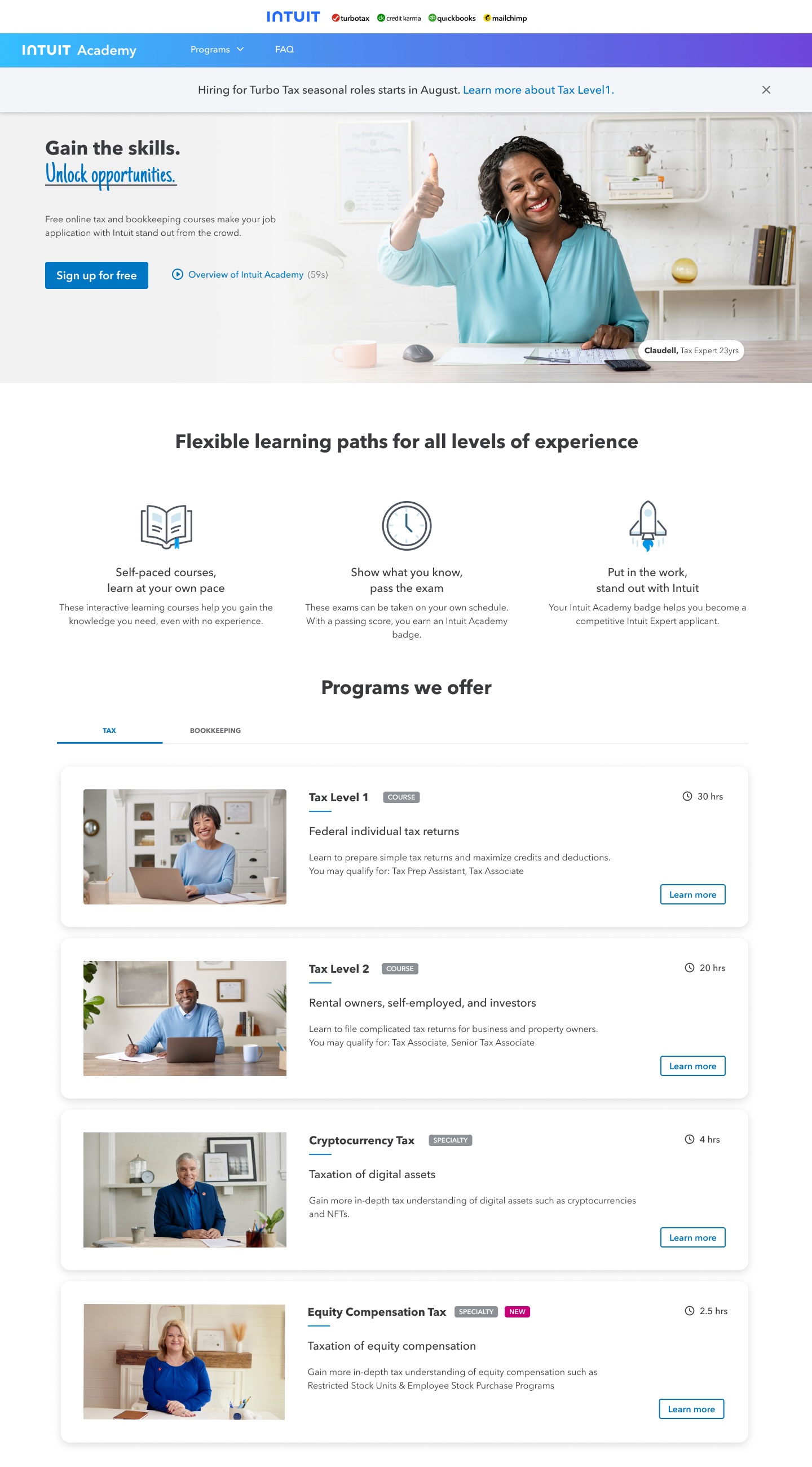
The above image shows the homepage when someone was just visiting and hadn't yet created an account and signed in.
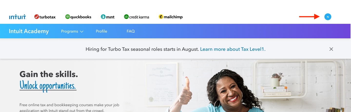
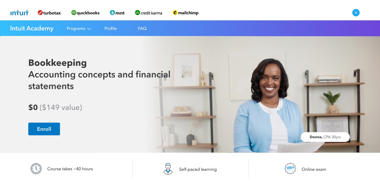
But after signing in, the homepage was exactly the same, except the for user's first initial now appearing in the upper right corner.

The button on course cards didn't change to "Enroll." Instead, you had to click the same "Learn more" button as before to go to a separate course details page and click "Enroll" from there.

Back on the homepage, the "Learn more" button was now "Resume learning," and a small line of text with an icon was the only indication of the learner's progress.
I've never seen a product design attempt to leverage the design of its marketing pages the way this one did! While there should always be consistent branding applied to an end-to-end experience, web marketing goals are fundamentally different from the goals of the actual product or service, which is why the product UX is always very different.
Messy information architecture
In addition to the web-marketing design making it tedious to do basic tasks like finding a course they'd already enrolled in, the information about each course was spread out in multiple places.

For example, the Tax Level 1 card on the home page had surprisingly little information. To get all of the information you needed to decide if you wanted to enroll, you had to click the "Learn more" button.
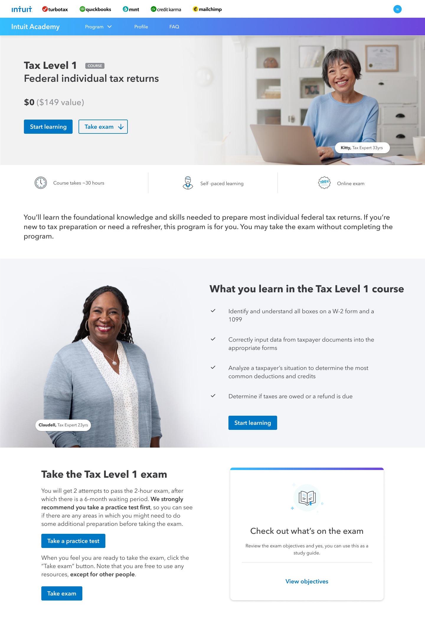
This opened the course details page. I felt this was unnecessary, and that with some consolidation we could get all the information necessary to make a decision about whether to enroll in a course on a single course card.
The original design also didn't give learners a clear view of the end-to-end process up front and throughout so they could see their progress. Each step was revealed to the learner only after they had completed the previous step.
Restricted access to users
The Intuit Academy leader didn't want us to interfere with active learners, so we couldn't observe real users in action with the existing system to see what they were trying to do and the problems they were having.
Tiny course catalog
Early on I did a competitive analysis of several other well-known corporate training platforms including Salesforce's Trailhead, Grow with Google, and Microsoft Learn. However, these platforms have huge catalogues across dozens of domains. In contrast, Intuit Academy had only two knowledge domains - tax and accounting - and half a dozen courses, with plans to at most double that number over the subsequent two years. The net result was we couldn't leverage any of the design concepts from successful competitive solutions and had to build a custom solution from scratch.
SOLUTION
Recruit recent hires
To solve the problem of having representative users we could to research and user testing with, I convinced the project sponsors to let me reach out to recently hired TurboTax Live and QuickBooks Live agents who had obtained a tax or bookkeeping badge through the existing Intuit Academy. While this was a biased sample in that we only talked with people who had successfully made it through the current program, it was much better than not talking to anyone. Plus the experience was relatively fresh in their minds. I interviewed ten people on the experience they'd had with the existing Academy platform, and also go feedback from those who were willing on the new design.
Reboot the information architecture
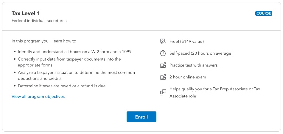
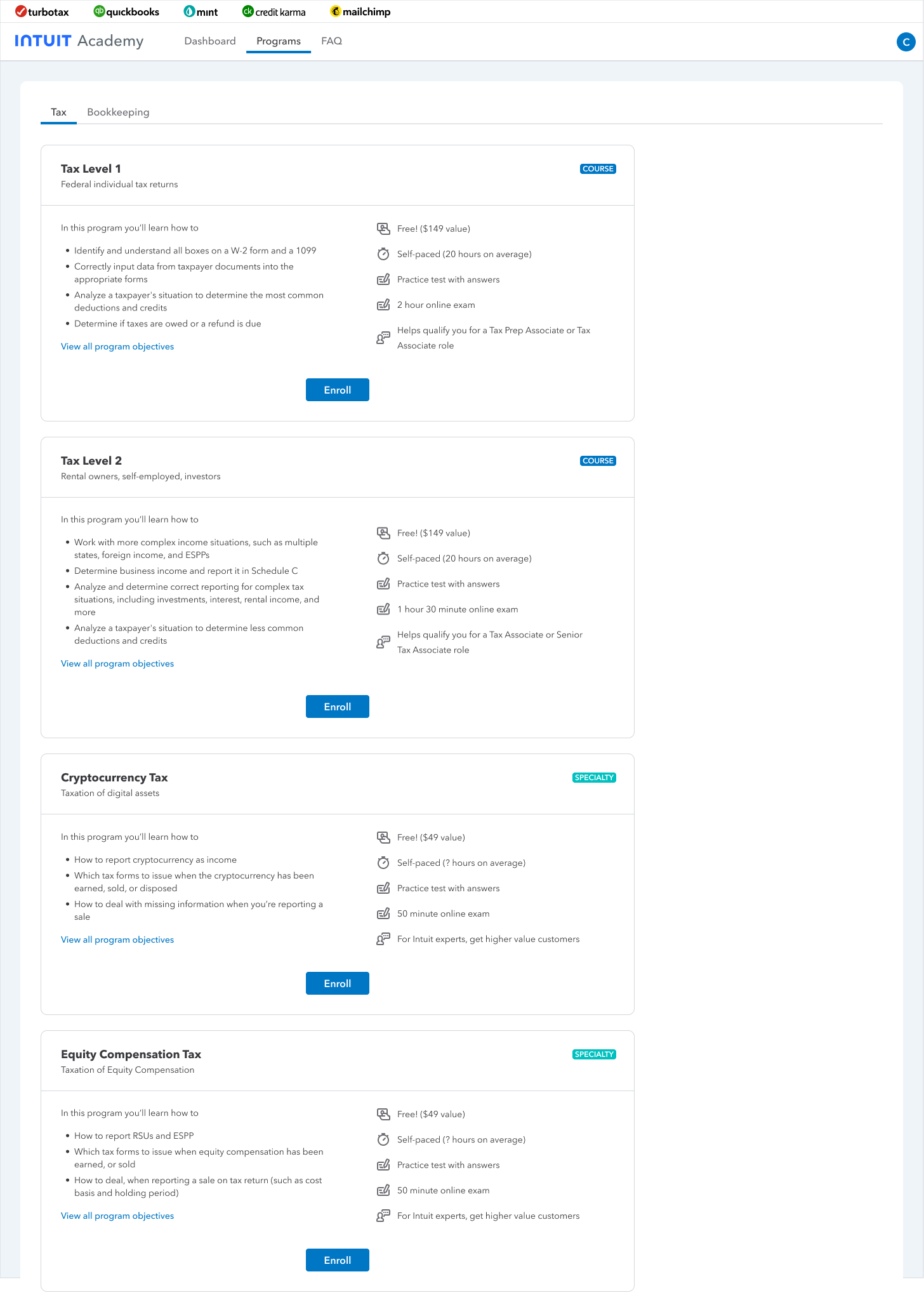
The first thing I addresed was the design of the course cards. As I'd suspected, I was able to consolidate all the information about the courses into a single card.
All the tax program cards could then fit on a single page, instead of four separate pages.
Create a dashboard
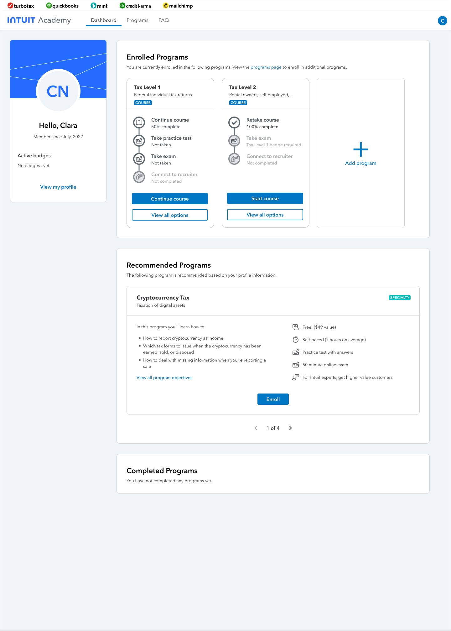
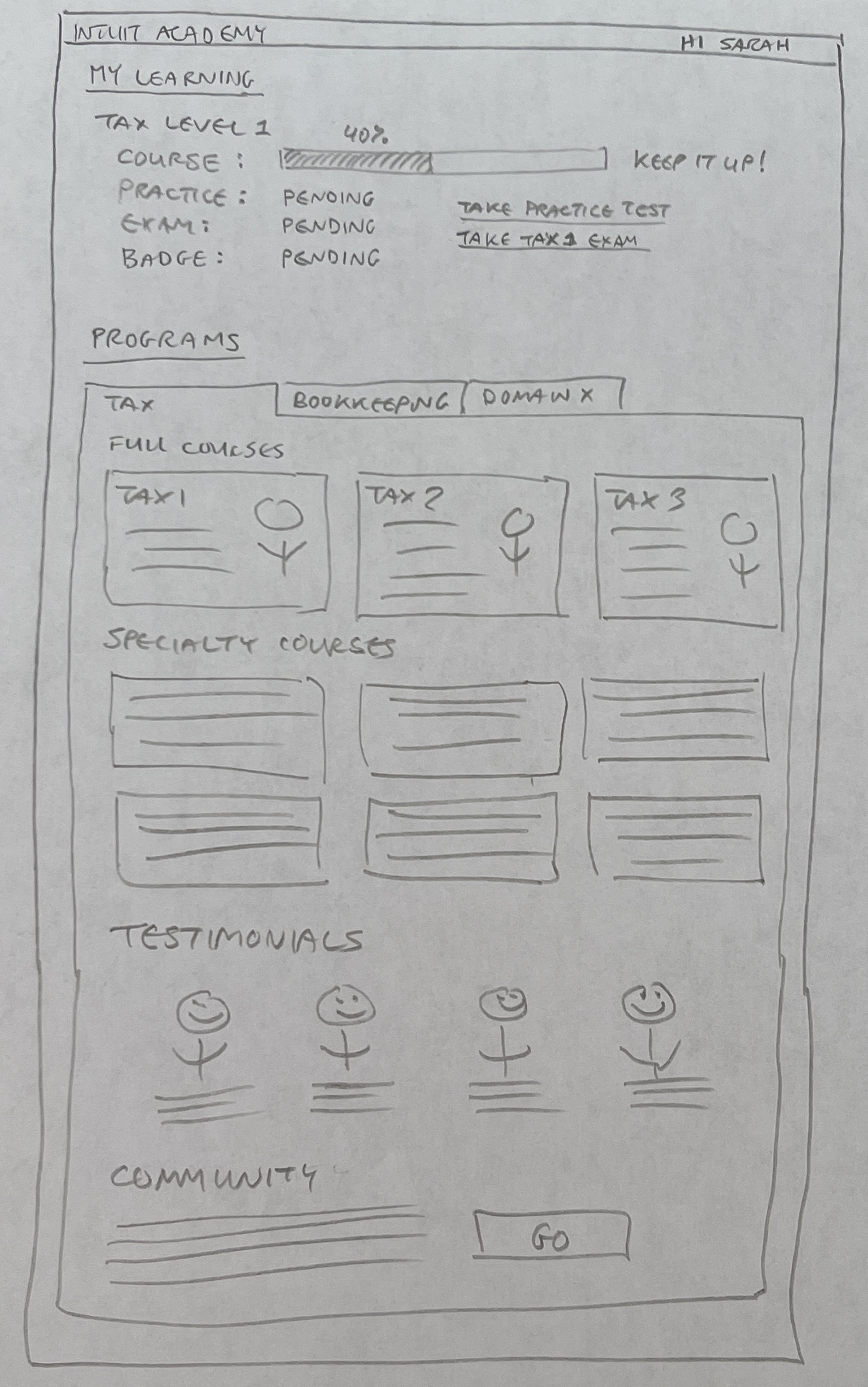
The core part of the design that needed to be fixed was a) not forcing the user to click around to find what courses they were enrolled in and what their progress was, and b) making it clear what the overall process was and where they were in it. To address the first problem, I first did some hand sketch explorations for a dashboard that would show what courses they were enrolled in, what their progress in each of them was, what the next recommended course was, and and so on.
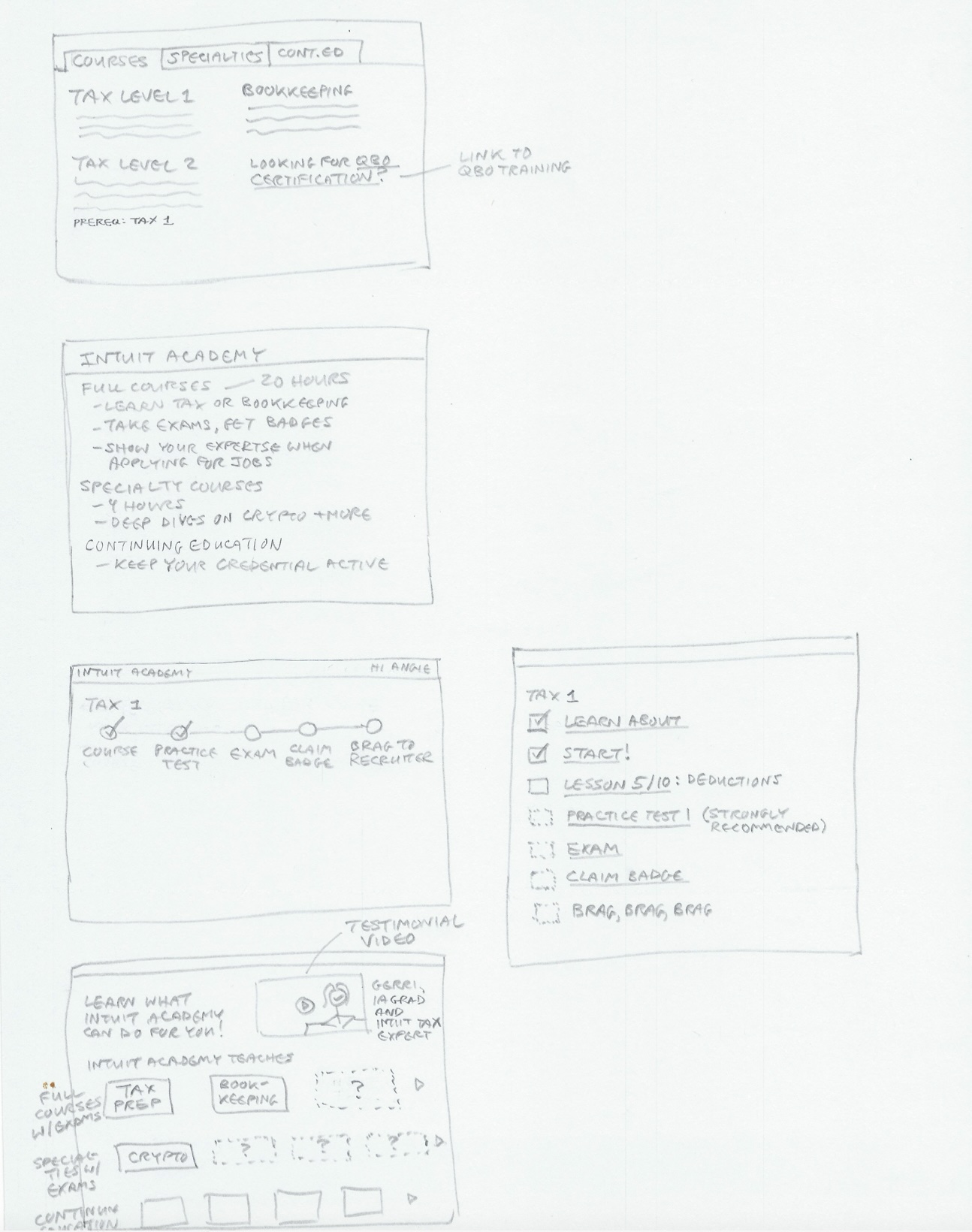
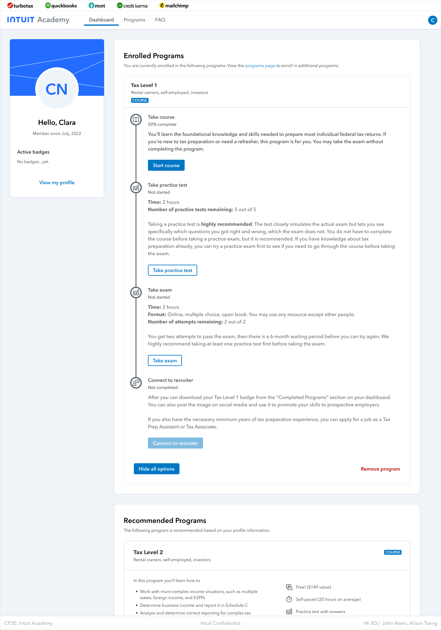
There was a fair bit of complexity in showing course progress however. The default path was to take the course, take a practice test, take the exam, and apply for a job as a TTL or QBL expert. But the only required step was taking the exam. If a learner felt they already knew the content they could skip ahead and take the exam right away. Or they could take up to five practice tests first before taking the actual exam. If they failed the exam once they could go back and take more practice tests. And so on.
To communicate all the possible nonlinear states of a learner's progress in a course, I created a variant in Figma that I used in the UX spec/prototype, but also the engineering team referred to the variant directly since it was convenient for them to see all the states in one place.

Improve the personalization
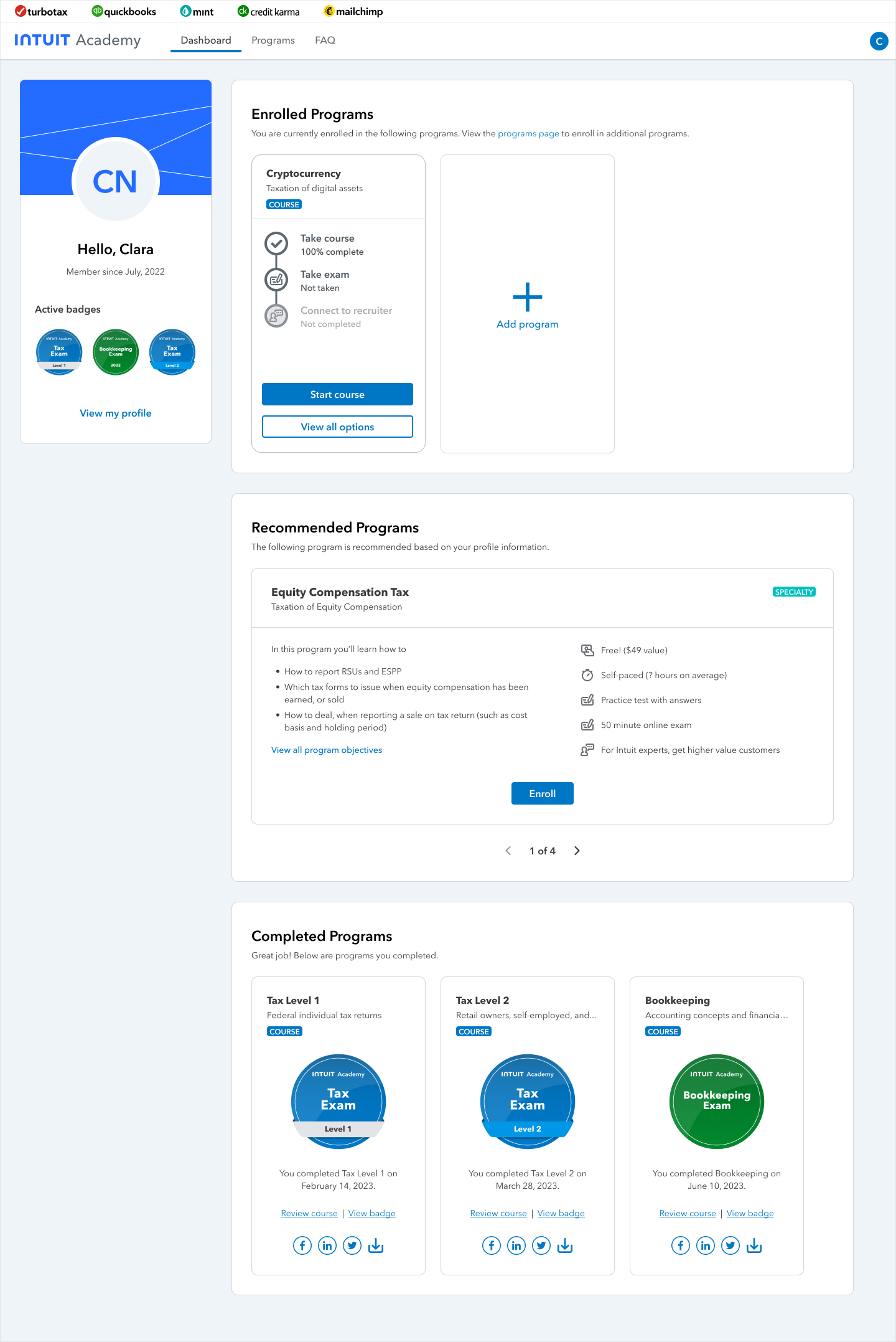
As part of addressing the dropoff at the top of the funnel, I wanted to improve the personalization of the experience wherever possible. So I added a section on the left side that persistently displayed their profile information, progress milestones they had reached, and any badges they had completed, and words of encouragement to keep going. I originally wanted to enable them to be able to add a picture of themselves as well, but it was shelved for the first launch due to privacy concerns.
RESULT
The screens below show the final dashboard design. You can see the learner never needs to leave the dashboard to see the courses they are currently enrolled in and can continue any course by clicking the "Continue" button. Also they could click the "View all options" button on any card to expand it to see additional information and jump to a different step if they wanted to.
As mentioned in the overview, the redesigned Intuit Academy increased the number of program enrollments by 12x, increased the number of certificate badges earned by 3x, and increased the number of hires from graduates into jobs as TurboTax Live experts by 7x. The redesign was so successful we were immediately asked to apply it to two new domains, QuickBooks Sales (for sales agents and retail sellers of QuickBooks products), and the QuickBooks ProAdvisor Academy.