OVERVIEW
Intuit TurboTax Live (TTL) connects TurboTax customers who need help completing their taxes with a tax expert. The original applicant tracking system (ATS) for hiring the experts was so hard to use though, the hiring team went rogue and created their own. But when the database began failing, the company launched an emergency project to create a customized ATS just for TTL before the next hiring season. If I had known anything about ATSs, I would have said it couldn't be done. But this was one of those cases where ignorance was bliss, and somehow in the end, we pulled it off.
CHALLENGES
Resources and scope
If you are like I was back then and don't know much about applicant tracking systems, here's an overview. Companies that make and sell ATS solutions to other companies have entire design teams, but I only had one other designer available to help me. While we were both principals and we had the advantage of only having to solve for only one hiring team, the scope of what we were being asked to do and the timeframe in which we had to do it was daunting.
Poor existing UX
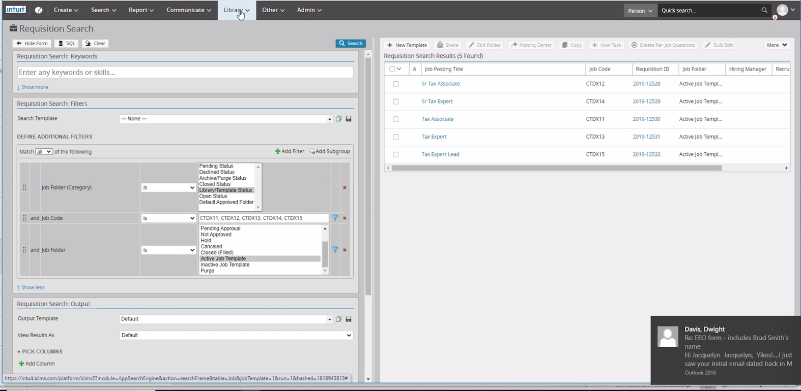
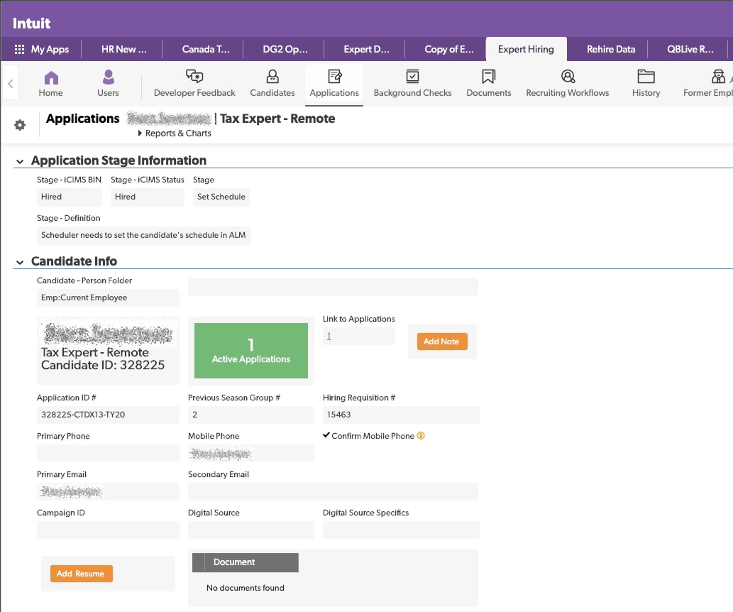
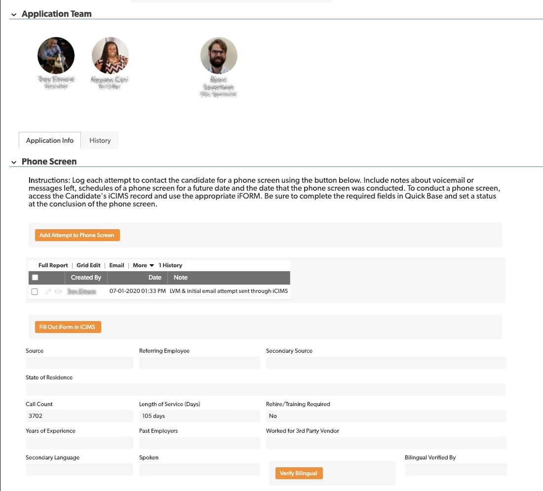
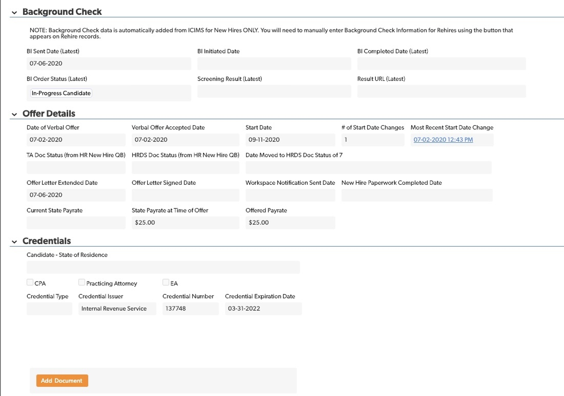
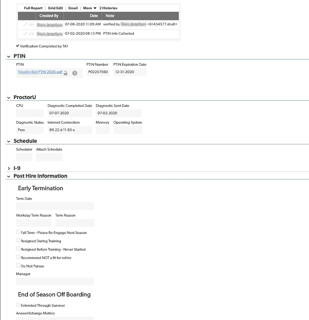
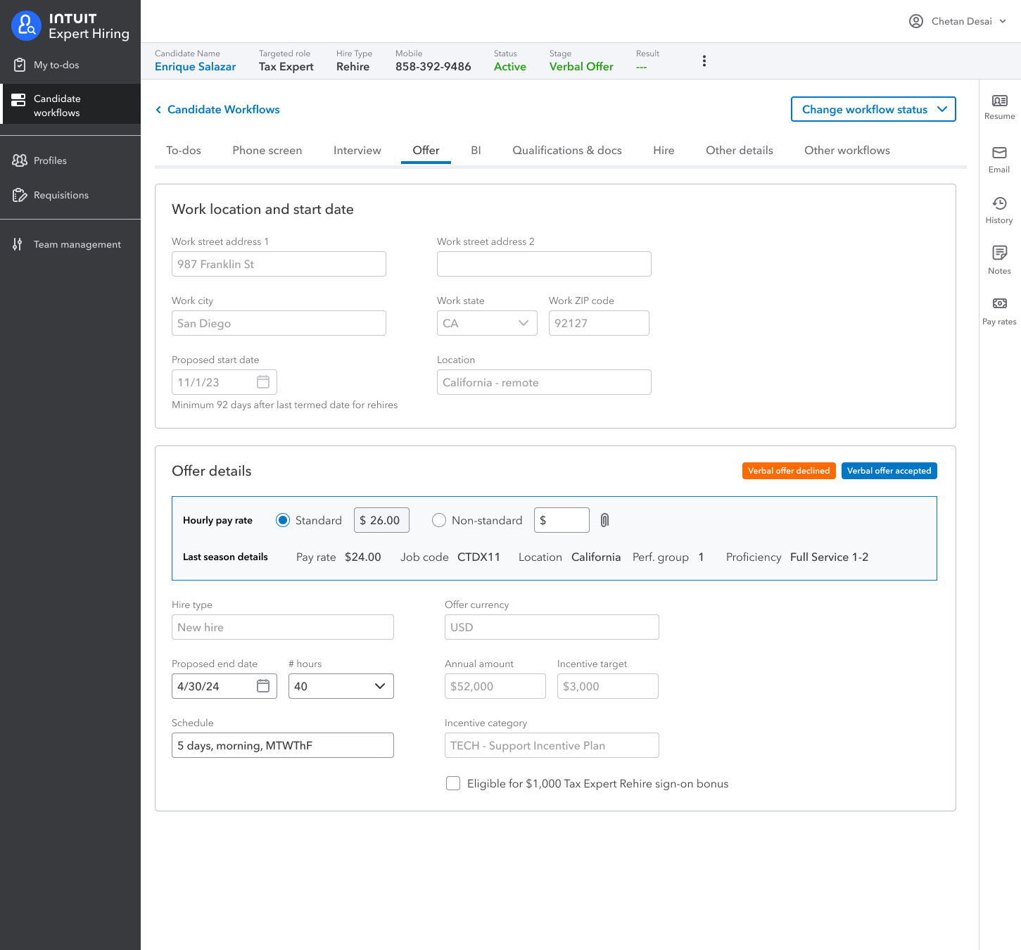
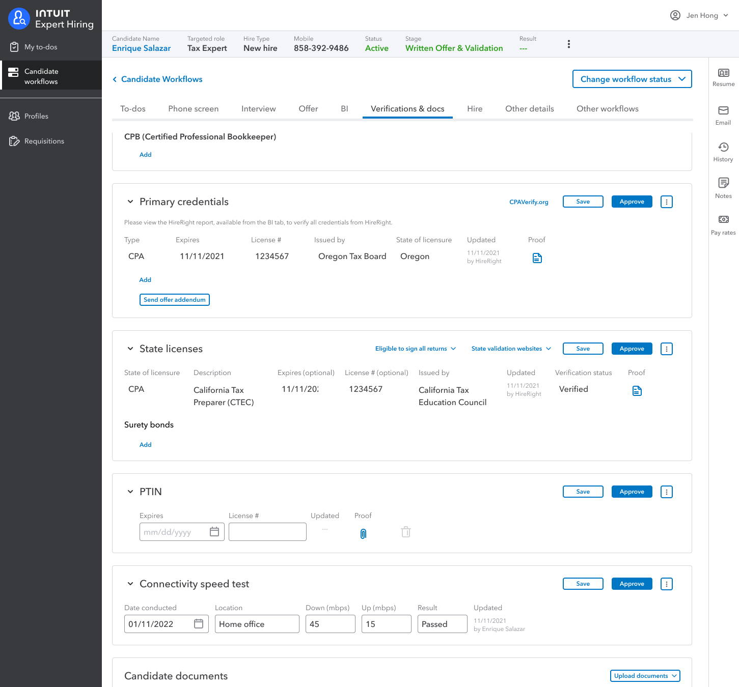
Above are a few screen shots from the original ATS, and below are some from the rogue app the hiring team made on their own. The latter were all part of a single giant web form the team had just continuously added onto over time.
Basically, other than seeing the data they needed to track, there wasn't much we could leverage.
Confusing information architecture
The hiring team had defined several stages in the hiring process, and to track progress in each they appended a variety of statuses to each stage name.
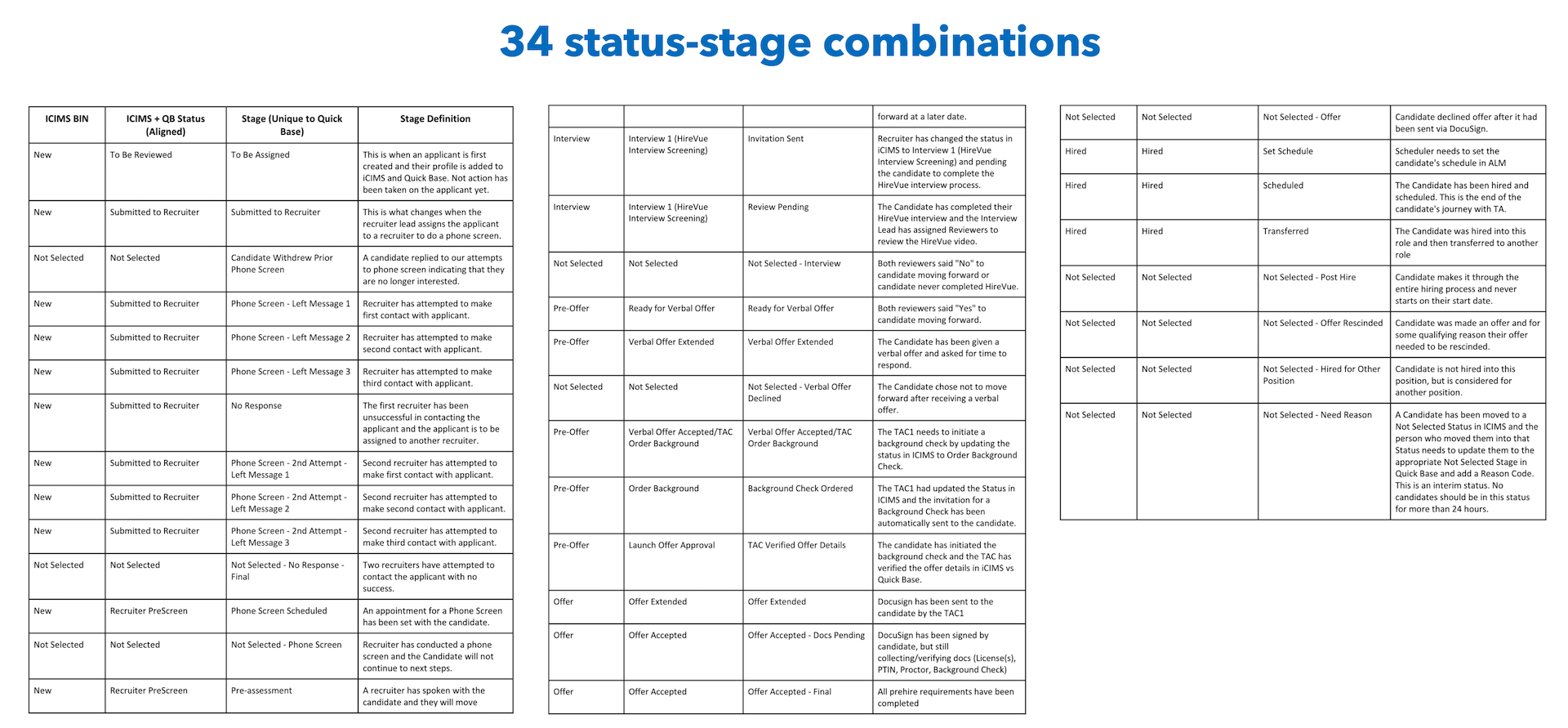
As they had continued to add statuses the number of combinations had become overwhelming. Worse, progress was often non-linear. For example, one candidate might approve their background check, then sign their offer, then provide their proof of credentials, while another candidate might do it in the opposite order. Within a stage it didn't always matter what order things happened in, they just all had to be done before going to the next stage.
Crazy candidates
Intuit hires 15,000+ tax experts every season. To hire that many qualified tax experts, they had to tolerate a lot of fickle candidate behavior. At most companies, if a candidate doesn't show up for a job interview, they're out. But for TTL the recruiter would call them back and try to convince them to keep going. If a candidate accepted an offer but later demanded more money, the system had to support going back to the offer stage to see if something could be worked out. Tolerating non-linear behavior like this made the system considerably more complicated.
Also, the existing system didn't track who was supposed to be doing what. If the recruiter was waiting on a candidate to accept or decline their offer, it wasn't reflected in the design. This negatively impacted the hiring teams' SLAs, making it look like they weren't doing their jobs when often it was the candidates making things take so long.
SOLUTION
Fix the information architecture
Getting the information architecture for a product correct at the outset is essential. You can add or remove steps in the hiring process, but if your design doesn't include the ability to track steps in the first place, retrofitting the system later on winds up being way more work and in my experience rarely happens in practice. In this case, I recognized the stage-status approach the team had been using was confusing and inaccurate, but I wasn't sure right away what the solution was.
I did some hand sketching to kick around some ideas, and what I found myself trying to track were actions.
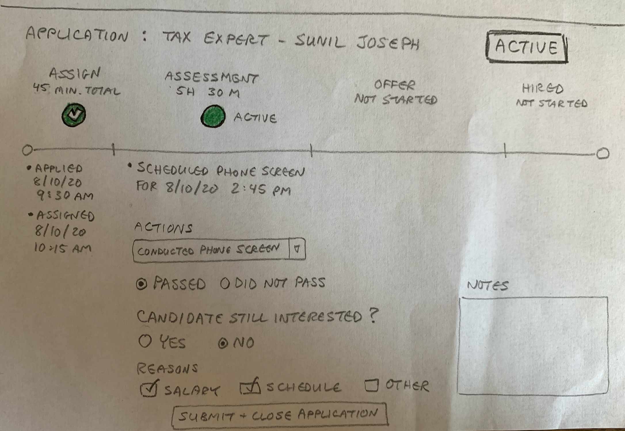
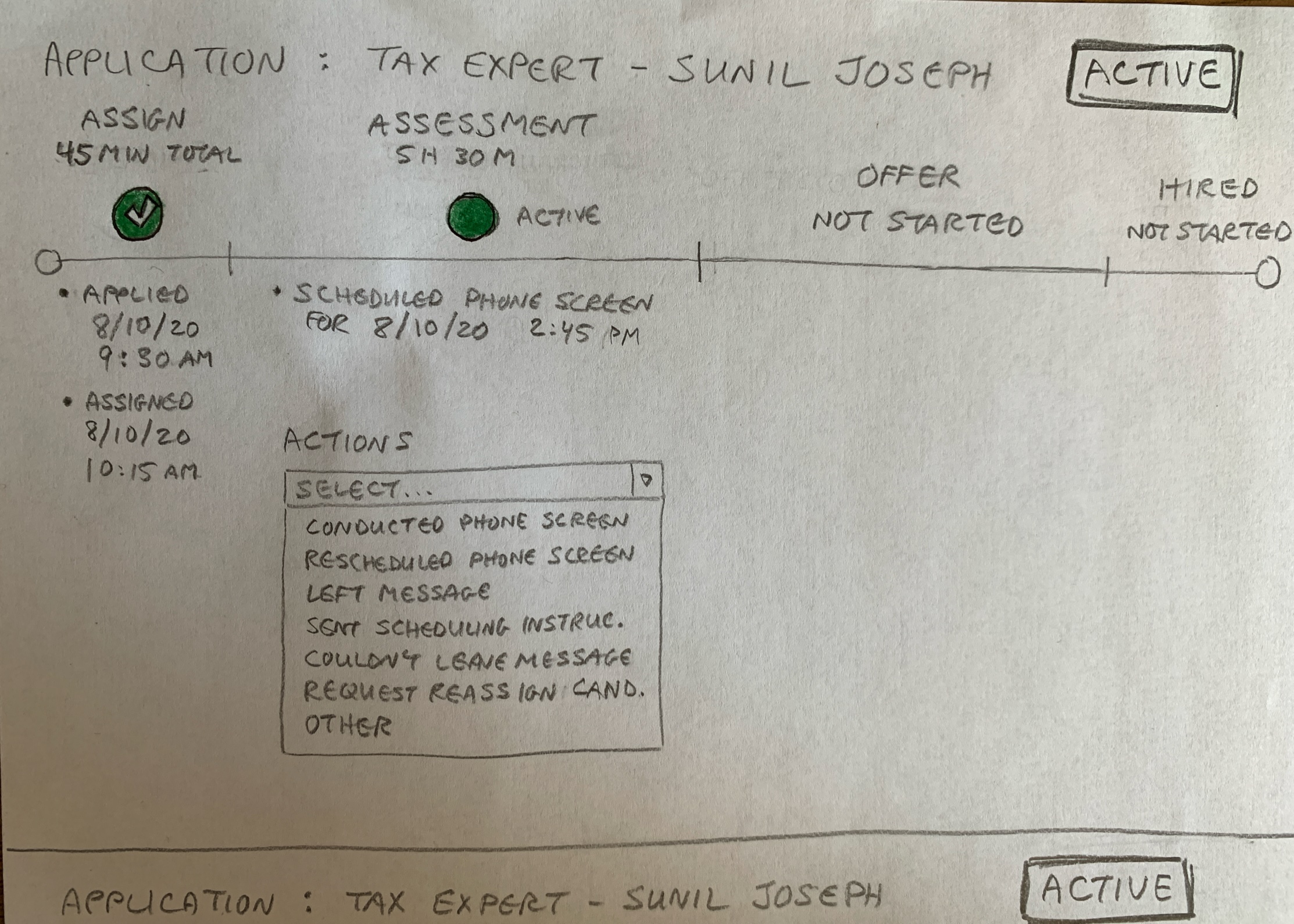
I wondered why we shouldn't just track actions directly - who needed to do what and when. Fundamentally this addressed the core problem of tracking a non-linear workflow where multiple tasks across multiple users could be in progress at the same time.
The only reason I could think of was it would make a lot more work for engineering, and we were already working on a really tight timeline. But if it led to a much better solution, it was worth it, so over an intense two-week period, I made my case to move away from stage-statuses to tracking actions directly. Or, as I began calling them, to-dos.
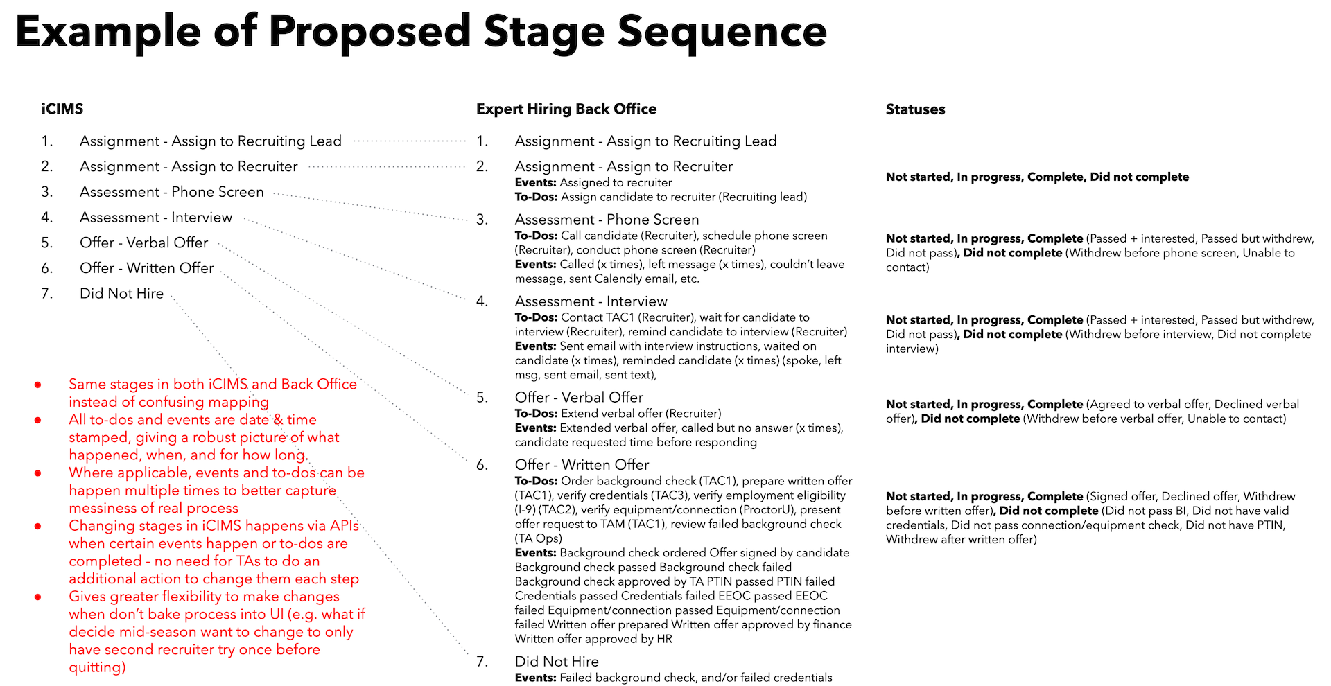
I didn't hit the team and project sponsors with the idea of tracking to-dos directly in the UI immediately. I knew I was facing an uphill battle to convince the hiring team to do things differently and for the engineering team to take on more work, and I didn't want to trigger an allergic reaction by dramatically revealing something significantly different in mockups without any prior context. Instead, I took the time to ease people into the idea with the slide above showing all the things we should be tracking.
Then I shared my hand sketches, first with the hiring team, then with engineering. The hiring team saw the benefit right away. As expected, the engineering leader wasn't convinced the benefit was worth the extra work. So I did a more realistic mockup that gave a better idea of what this approach might look like.
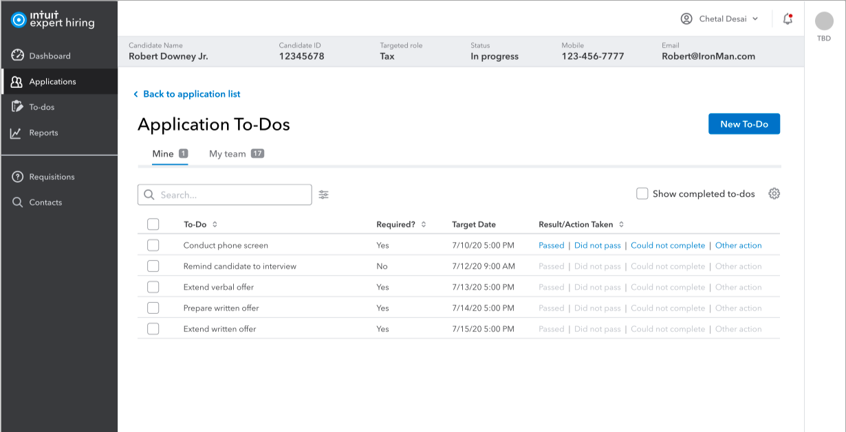
This and some other mockups convinced the dev team that while the scope of work with to-dos was certainly bigger, it wasn't an order of magnitude bigger. It also showed that by avoiding the sloppy status tracking of the previous system it would not only make things better not just for the hiring team but also themselves, by not having to support a workflow that was pretending to be linear but often was not.
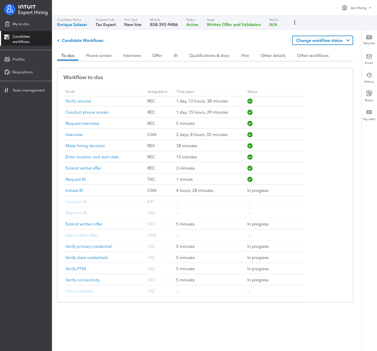
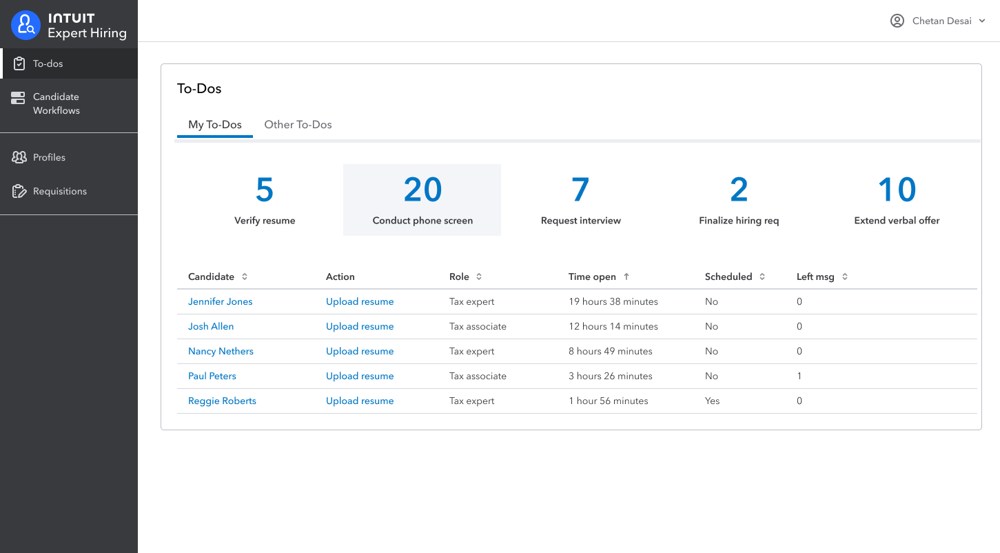
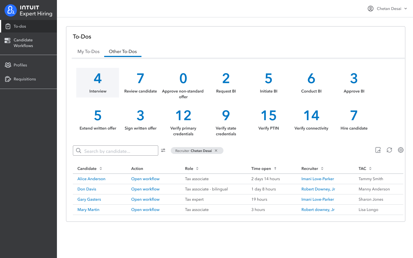
Later mockups made it even clearer how much better the new approach was at dealing with non-linear behavior. For example, in the Offer stage you could now see how multiple actions were in progress at the same time, rather than trying to pretend they were happening in a linear order. This way anyone could easily see exactly where a candidate was in the hiring process.
Capture the E2E workflow
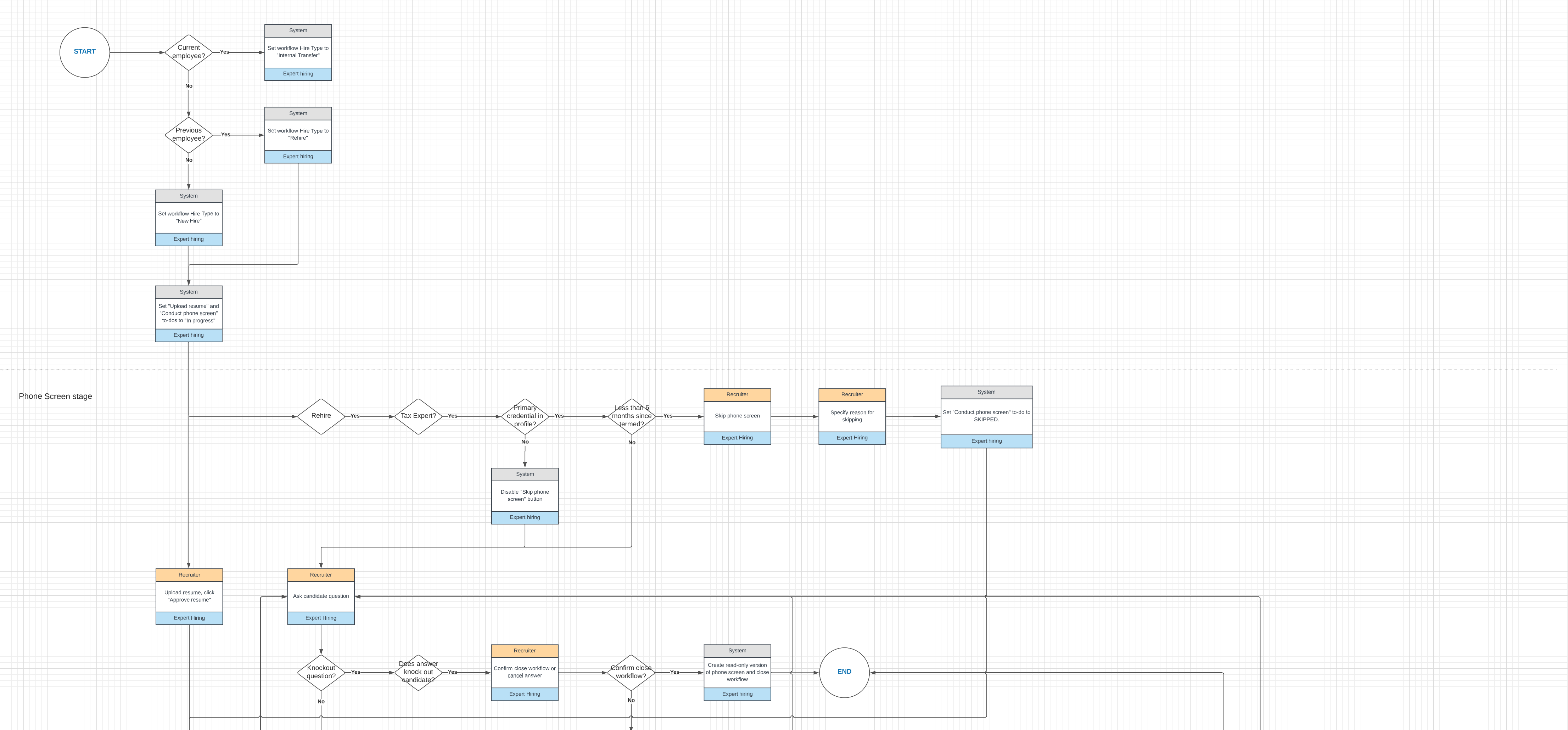
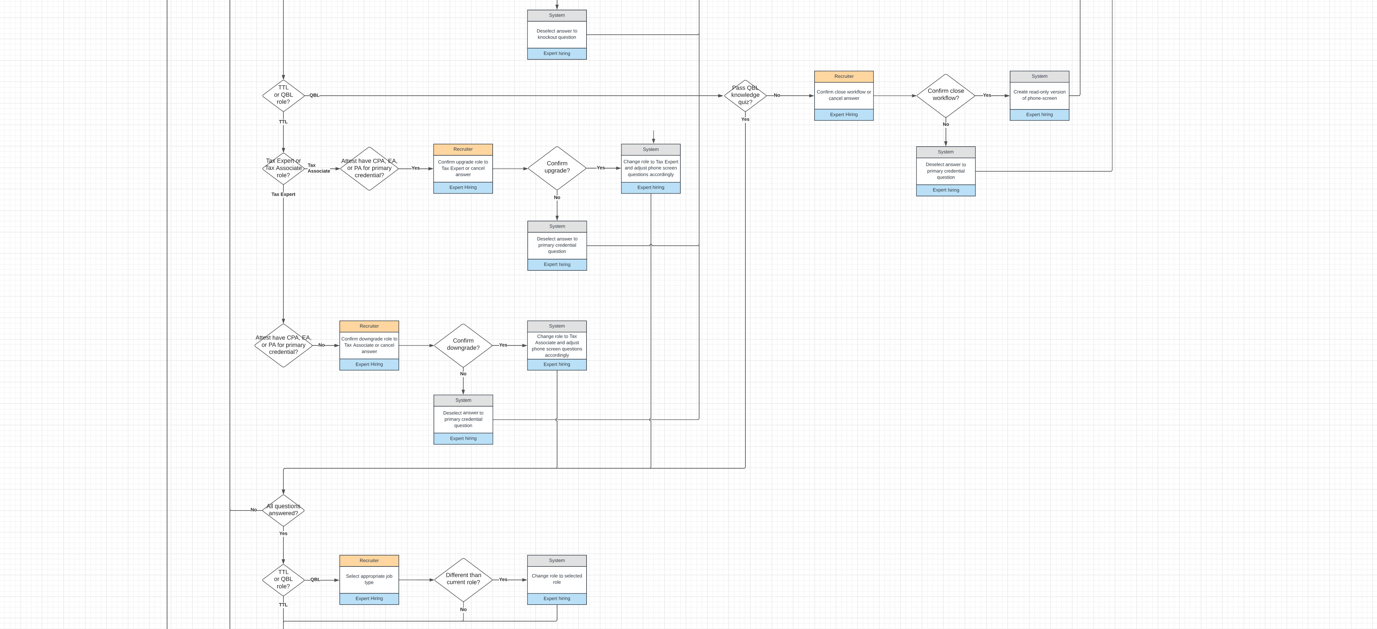
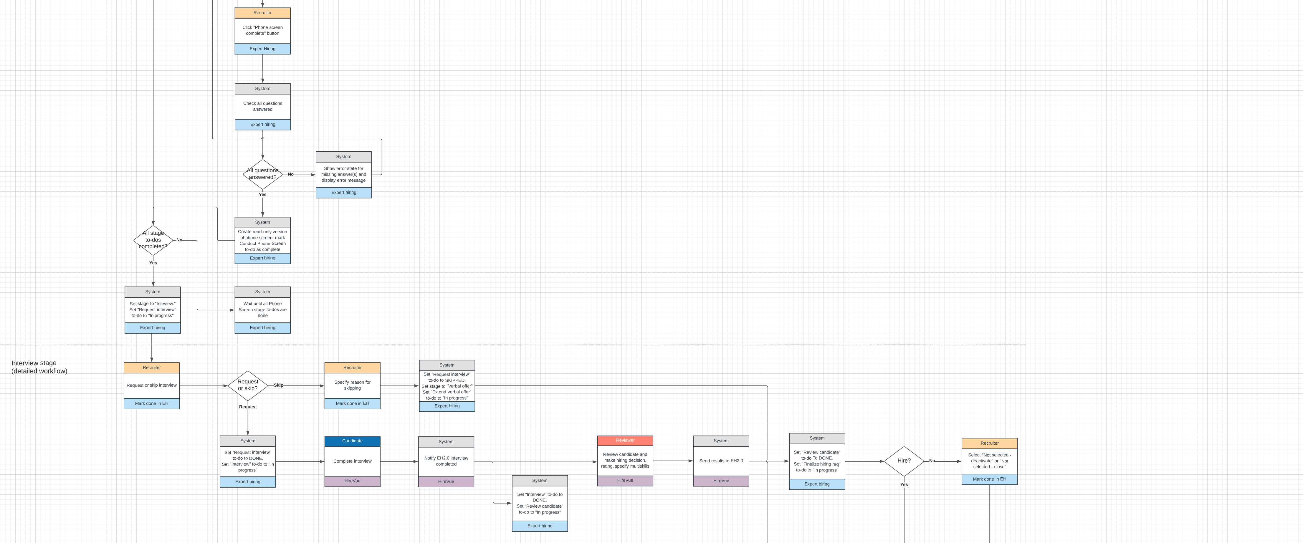
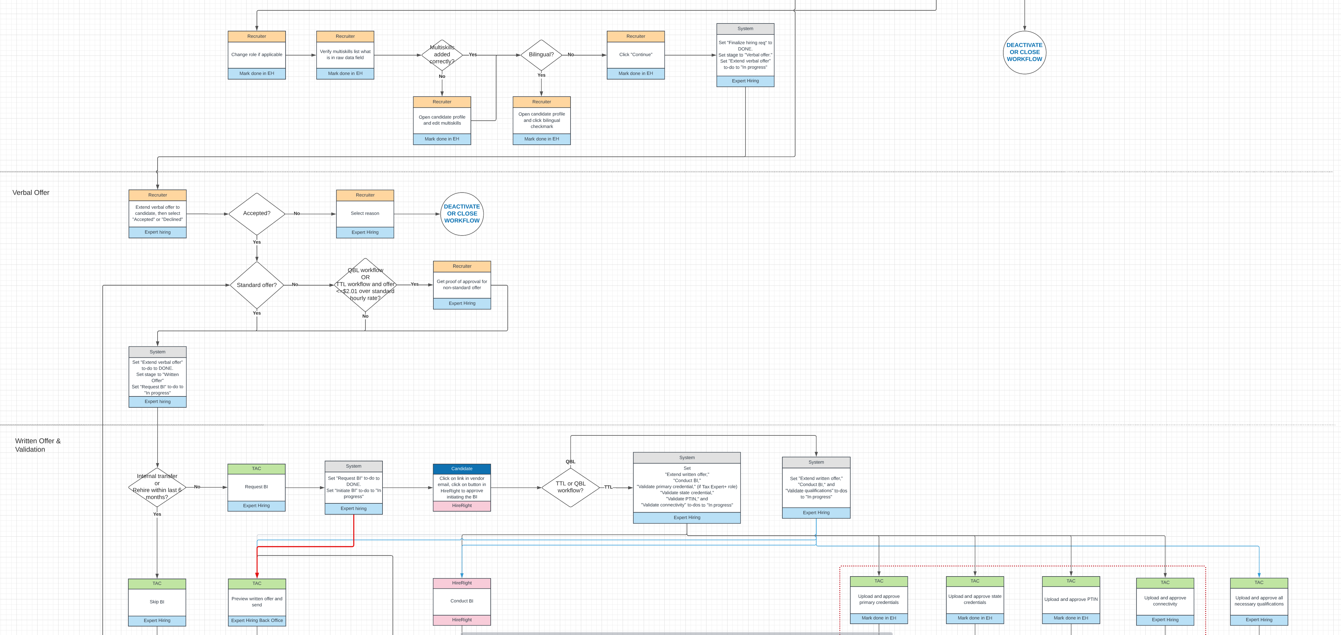
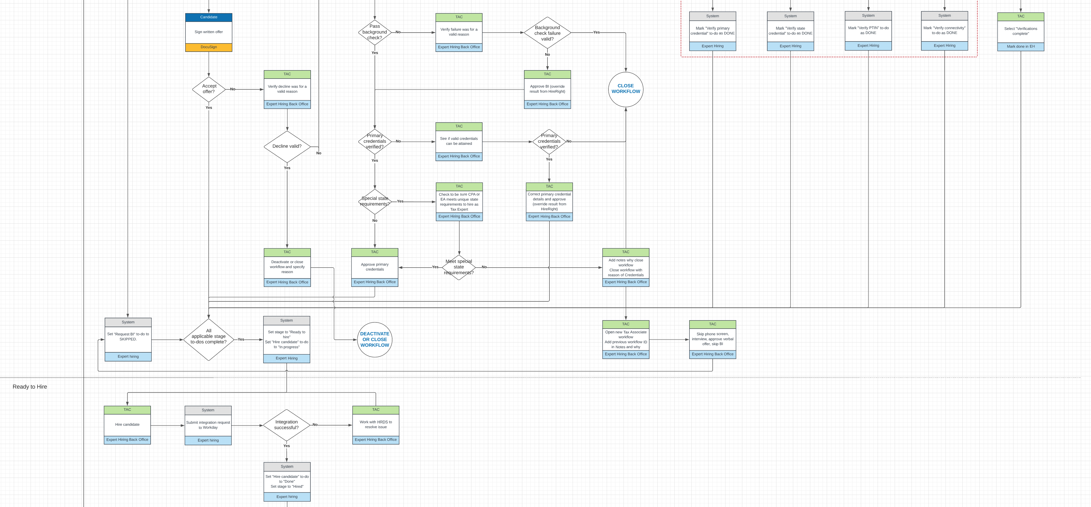
After getting the go-ahead to switch to to-dos, I made a workflow diagram to capture the end-to-end (E2E) behavior of the the new system. I've always found workflow diagrams to be very effective at bridging the gap between the product requirements document and the UX specification, helping teams debate and align on how the product or system they're building should behave.
If I'm co-located with a team I actually print these out and post them on a wall and let people mark them up. It helps to develop a shared understanding and show where things are getting overly complicated. Plus I always feel people remember the process better after walking through diagrams like this several times.
Innovate or die
I've focused on the workflow change to using to-dos because it was far and away the most important problem, but there were many, many other problems we had to deal with. One was user research. The other designer and I both had a lot of experience in research and we agreed that if we used the standard process of recruiting users at various points to get feedback on our designs we'd never meet our deadline. So we tried something new and put together a rapid feedback team of 4-5 recruiters and 4-5 talent acquisition coordinators (the people who manage the paperwork). This group became our cooks in the kitchen who we contacted several times a day to ask questions and get immediate feedback on ideas or designs. Essentially it was perpetual participatory design, and it proved invaluable for developing a successful solution as quickly as we did.
Also, communication and staying in sync was a concern since the other designer and I weren't co-located, we also set up a daily 15-minute designers-only sprint meeting just with the two of us, in addition to the regular product team standups. This was a great forcing function that kept our interaction paradigms and visual design synced and made sure the workload was always shared equitably.
Also, communication and staying in sync was a concern since the other designer and I weren't co-located, we also set up a daily 15-minute designers-only sprint meeting just with the two of us, in addition to the regular product team standups. This was a great forcing function that kept our interaction paradigms and visual design synced and made sure the workload was always shared equitably.
RESULT
In the end, we successfully migrated the TTL hiring team to the new system, reduced the overall time to hire by roughly 20%, and earned rave reviews from recruiters and other members of the hiring team. The system is still in use several years later, and hasn't suffered any significant downtime during the hiring season.
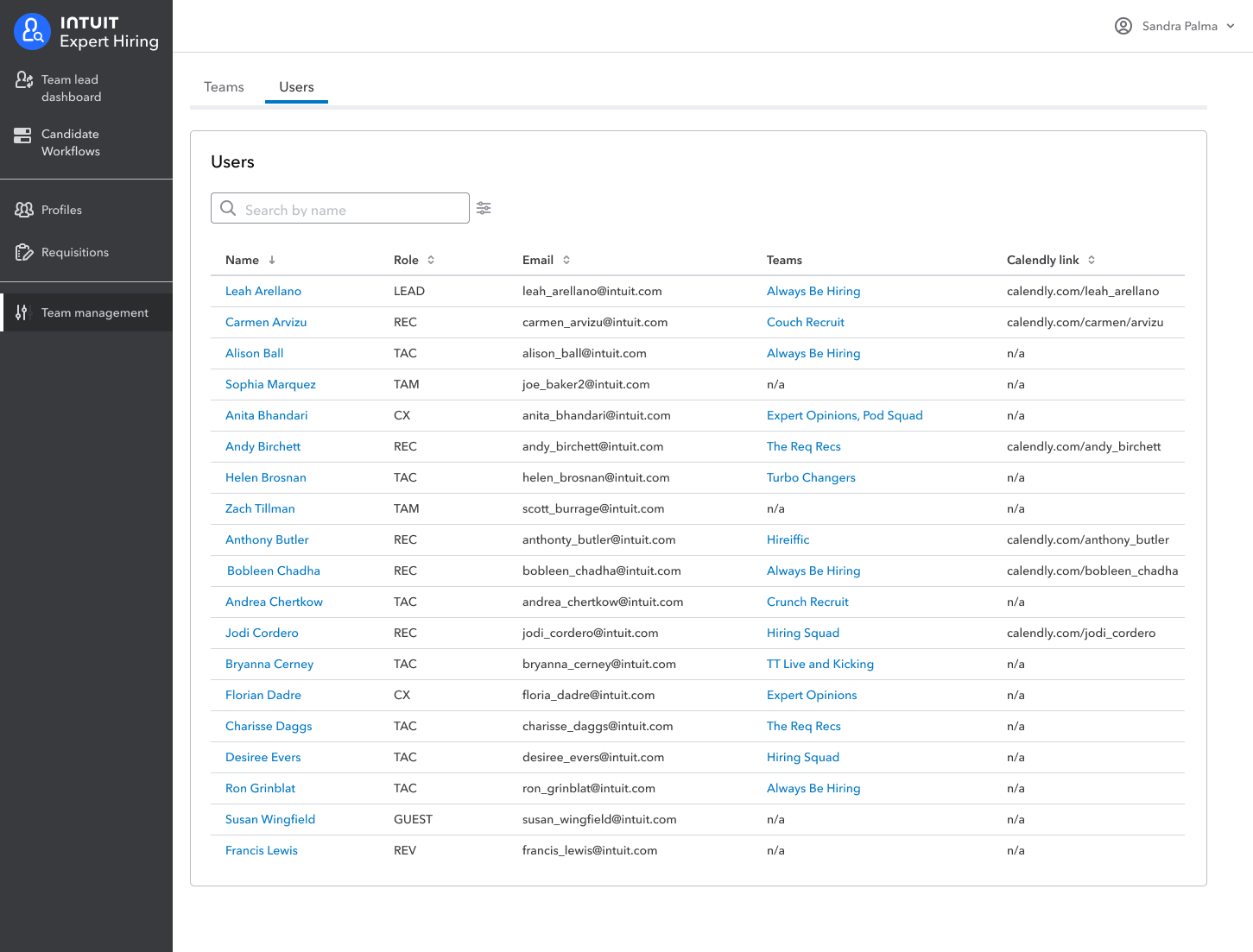
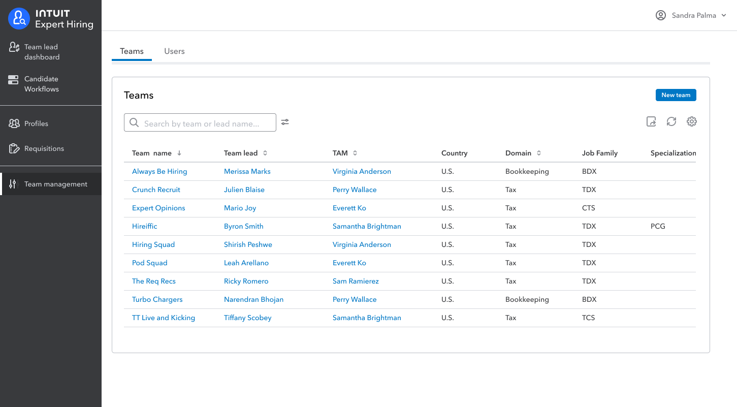
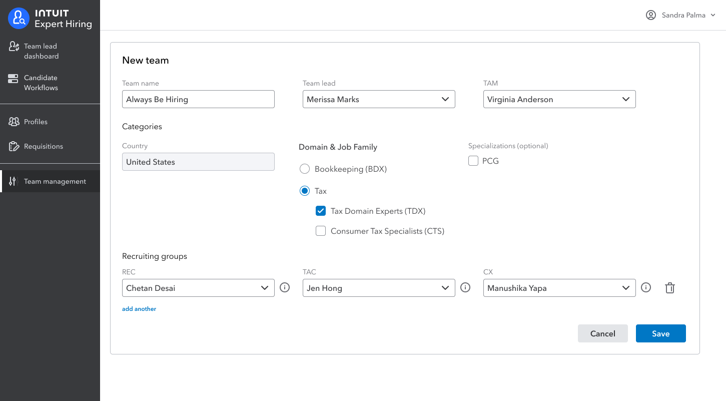
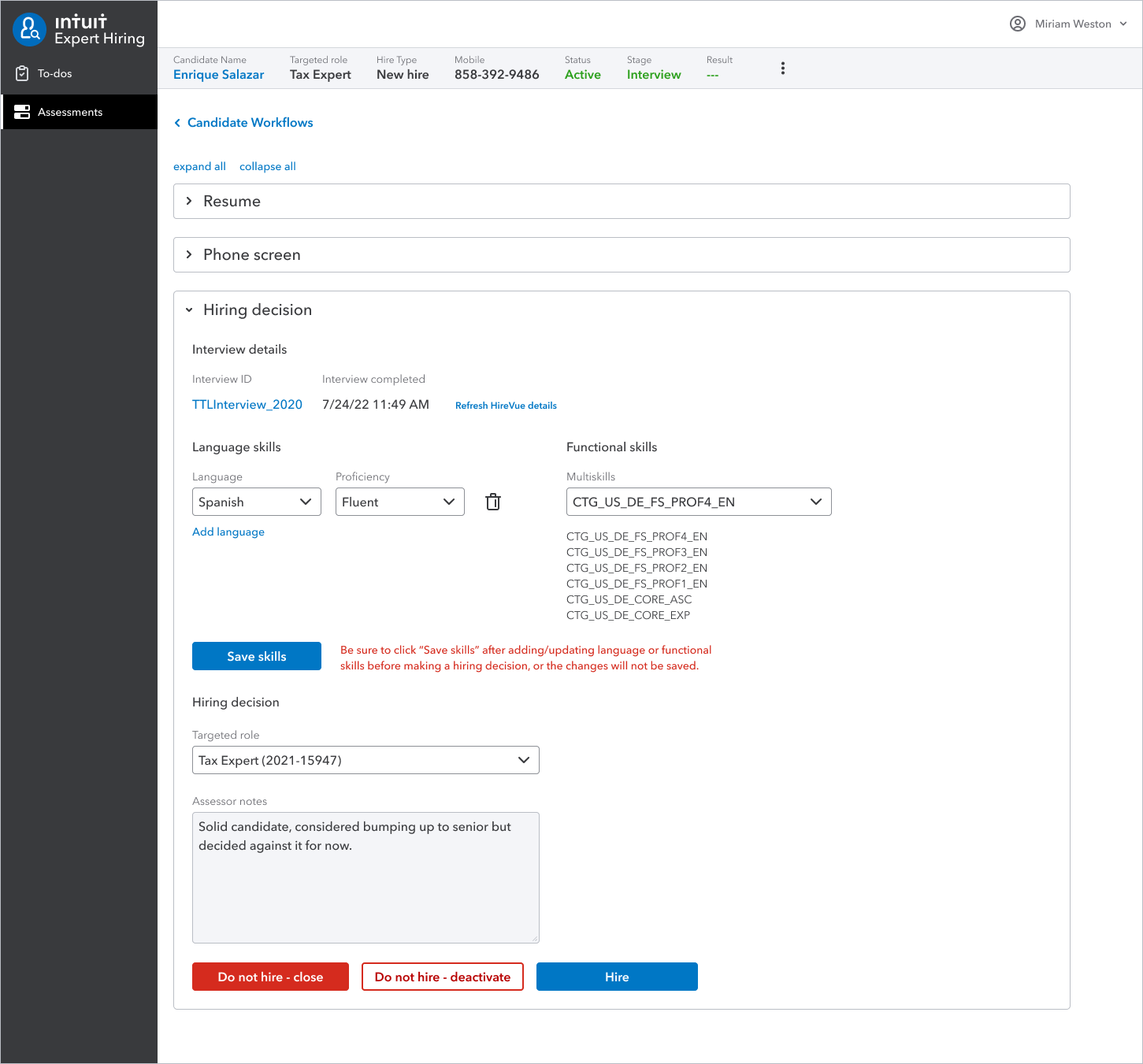
Below are some screens from the final design.